Click here to read on Classy.
By KORRIN BISHOP
Your donation button is a key element that needs to be intentionally designed and located as one of your nonprofit’s main calls to action. There is some standard guidance on how to showcase your donation button on your website, such as ensuring it is easy to find, links to the correct page, and stands out by using contrasting colors. However, you also need to strategize its usage across your different fundraising campaigns, so your visitors are more likely to take action as they digest and engage with your page.
Below, we look at creative ways to format your donation button across different fundraising campaign types, and include examples from five nonprofits who have done just that.
1. Peer-to-Peer Campaigns: Focus on Strategic Placement and Visual Distinction
Peer-to-peer campaigns provide supporters the opportunity to fundraise on your behalf, but a donation button also collects one-time (and recurring) gifts for your campaign. These two calls to action live on your campaign page, so visually distinguish them from each other.
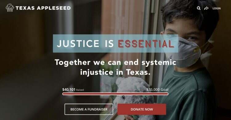
One example comes from Texas Appleseed, a nonprofit working to “promote social and economic justice for all Texans by leveraging the skills and resources of volunteer lawyers and other professionals to identify practical solutions to difficult systemic problems.” The nonprofit used a peer-to-peer fundraising campaign to raise over $35,000.
At the top of their campaign page, Texas Appleseed highlights their calls to action to fundraise and donate. The “Become a Fundraiser” call to action (CTA) leads the two with a transparent background and white outline that grabs visitors’ attention. Next to it is the highly visible donation button in red. Each CTA’s visually distinct yet grabby design catches the eye, and the strategic proximity of these two buttons—visible at the top of the fold as soon as a supporter lands on the page—gives supporters multiple opportunities right away to help the nonprofit reach its goal.
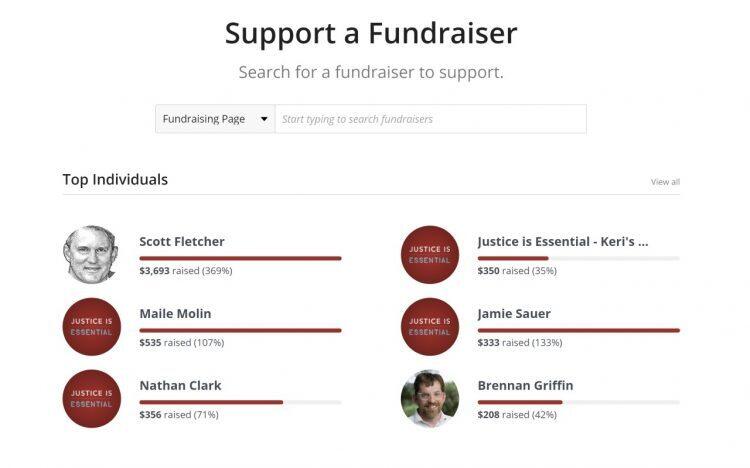
Farther down the campaign page, the nonprofit further highlights the peer-to-peer component by listing some of the campaign’s top fundraisers and including the headline “Support a Fundraiser,” so donors are also encouraged to to give directly to a peer’s personal fundraising page.
For peer-to-peer campaigns, strategic placement of a donation button alongside your CTA to fundraise can engage more donors by offering options for how they can participate.
Read Next: 5 Peer-to-Peer Resources for a Winning Strategy
2. Crowdfunding Campaigns: Vary Your Donation Button Options
Crowdfunding campaigns allow for maximum creativity when it comes to your donation button. Below, we share examples from two different nonprofits that varied their donation button options across their Classy crowdfunding campaigns.
Incorporate Multiple Types of Donation Opportunities
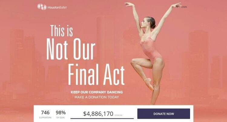
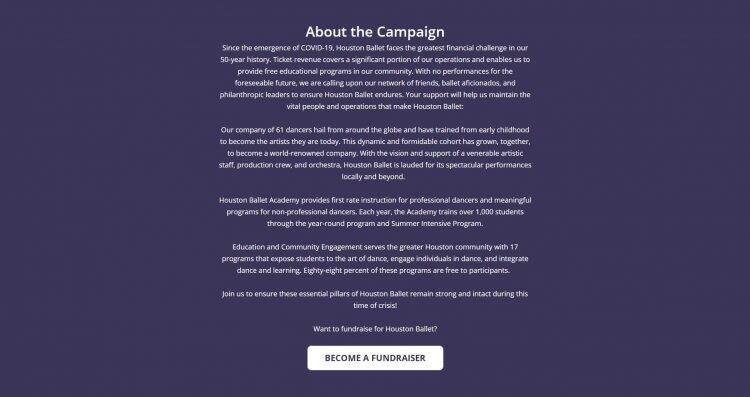
Classy customer Houston Ballet started a crowdfunding campaign to keep its company dancing despite significant challenges resulting from COVID-19. On its crowdfunding page to raise $5 million, the nonprofit incorporated three different donation opportunities, all of which would support the overall goal.
First, the crowdfunding page displays a visually contrasting “Donate Now” button next to its progress bar on the homepage of the campaign. This creates a quick, easy way for donors to see the social proof of others having supported the cause, and they can immediately take action as well.
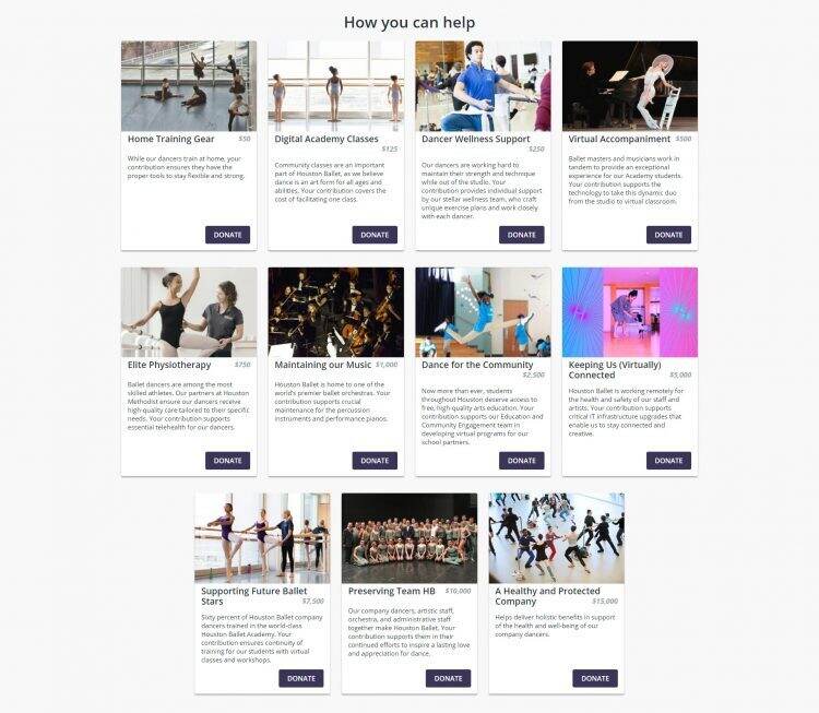
Further down the page, the campaign uses impact blocks to suggest how different levels of donations can help support the nonprofit during these times. It uses imagery in line with its brand and specific details on how the donation will make a difference, such as home training gear and digital academy classes.
In the final section of the campaign page, the nonprofit includes a “Become a Fundraiser” button that encourages supporters to start their own personal fundraising pages to make an even bigger impact.
By offering multiple donation buttons that cover various styles and fundraising types throughout your crowdfunding campaign, you give your supporters choices for how they can help meet your goal. Your donation buttons progressively tell your campaign’s story as the supporter scrolls through your page.
Leverage Impact Blocks to Showcase Recommended Donations
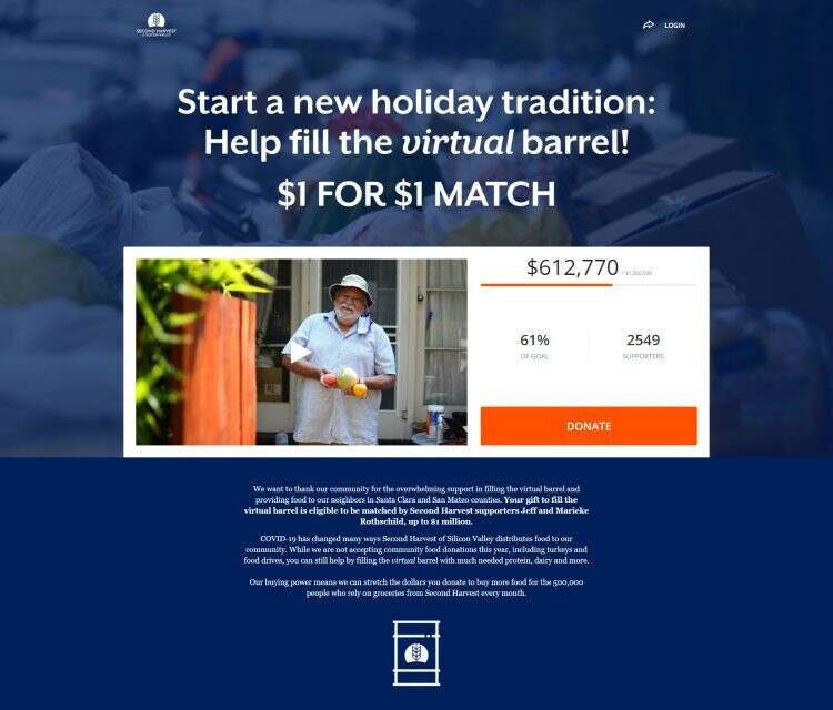
Second Harvest of Silicon Valley provides healthy meals to anyone who needs one within their community. Due to COVID-19, they haven’t been able to collect in-kind donations of food from supporters like they would have in the past. They started a crowdfunding campaign as a way to fill the gap this caused in their operations.
The initial donation button for Second Harvest of Silicon Valley’s campaign is easy to find on the campaign landing page, in a bright orange and placed next to a short video message showcasing some of the nonprofit’s beneficiaries.
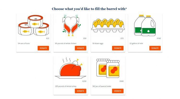
The nonprofit then leans into the campaign’s story, which focuses on how the nonprofit’s food distribution looks different this year. It expresses how instead of in-kind food drop-offs, supporters can give a monetary donation for a particular item.
The nonprofit then uses impact blocks to show how different gift amounts can provide for specific food items typically provided in-kind. For example, the $50 impact block has a graphic of a roast chicken and says you can “fill the barrel” with 85 pounds of whole chicken. The custom illustrations are also visually engaging, complete with donation buttons in the orange color specific to their branding.
By adding creative impact blocks with donation buttons on your crowdfunding campaign, you provide a fun way for supporters to understand the tangible impact of their donations and be motivated to give toward your goal.
Download Now: Checklists for Crowdfunding, Peer-to-Peer, and Event Campaigns
3. Fundraising Event: Pair One-Time Donation With Registration
Fundraising event campaign pages are also an opportunity to think strategically about your donation button. For ticketed events, your main CTA is to buy a ticket. In registration with fundraising, you want your supporters to register for your event and then start fundraising as well. In both event instances, you can pair a donation button with your main CTA to capture gifts.
Special Olympics Washington created a registration with fundraising campaign page on Classy for its 2021 Polar Plunge Challenge. On the landing page for its campaign, it includes a “Register” button alongside their donation button in the center of the hero block, under the event logo. Further down the page, the nonprofit again pairs a registration button with a donation button next to their progress circle, giving another chance for people to be inspired by the active support for the campaign and to take action themselves.
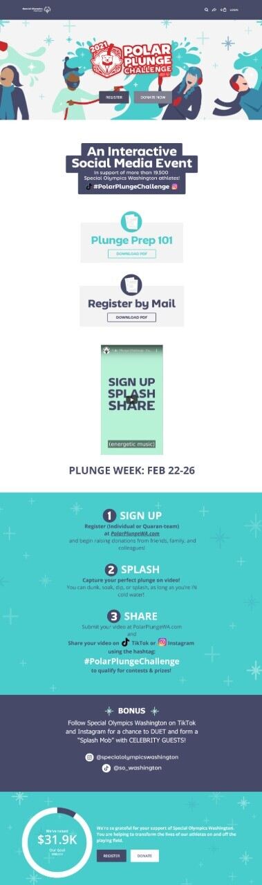
Visually distinguish your registration and donation buttons. The inclusion of the latter is important though for both participants inspired to donate more in that moment, as well as people who can’t make your event, but still want to provide support.
Download Now: The Ticketed Event Cheat Sheet
4. Recurring Giving Campaigns: Pair Donation Button With Powerful Language
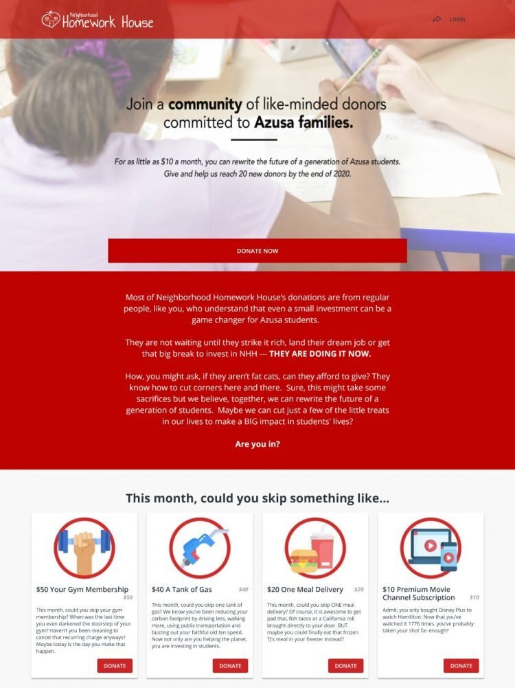
Neighborhood Homework House started a recurring giving campaign to fund its mission to support students in its community. Its initial donation button is paired with text that is branded around the nonprofit’s recurring giving campaign. It explains, “For as little as $10 a month, you can rewrite the future of a generation of Azusa students.”
Below the initial donation button is additional text describing the power of small donations and that you can start supporting now by giving up little monthly expenses. The campaign then incorporates impact blocks that showcase examples of things a supporter could skip each month to be able to donate to the nonprofit instead. For example, a supporter could choose to donate their $40 tank of gas or a $20 meal delivery.
By shaping your donation buttons around your recurring giving story, you build a case for your supporters to join your campaign.
Download Now: 8 Email Templates to Upgrade Recurring Donors
Think Creatively About Your Donation Button to Increase Supporter Engagement
Strategic use and formatting of donation buttons can increase support across different campaign types. Think creatively about what types of donate buttons to use, how to place them, and ways to brand them to your mission to engage your audience and encourage donations.
Return to Insights & Events