Click here to read on Classy.
By ELLIE BURKE
A successful Giving Tuesday campaign requires certain thoughtful elements. To help you identify and wrap all of these factors into your page, we sat down with the customer success management team at Classy for their advice on how to design a stellar campaign. For more helpful information like the lessons below, be sure to check out our free Giving Tuesday resource library.
Get My Free Giving Tuesday Resources
The images and instructional text below walk you through a Classy crowdfunding campaign step by step so you can be sure you’ve not only covered the necessary bases, but that you’re helping your campaign live up to its fullest potential.
Let’s get building.
Campaign Landing Page—Key Components Explained

1. Header
Upload your organization logo to the header, or create a special Giving Tuesday logo by combining yours with the Giving Tuesday logo. The logo should have a transparent background. Make the entire header transparent to avoid cutting off the top of your hero image. You can visit Giving Tuesday’s site for logo assets.
2. Hero
You only have a few seconds to grab a supporter’s attention. Use powerful imagery in the Hero Block to help supporters immediately develop a connection to your campaign. Instead of placing important text or logos within your Hero Background Image, use a Headline Image to do so as it lies on top of the Hero Background Image and is seen directly above the call-to-action buttons. Headline Images will always fully display on mobile devices. To make the Headline Image or text pop, try lowering the opacity of your Hero Image. No matter the Hero Block content, your donate button should be visible above the fold on desktop.
3. Progress
Hide the progress bar until you’re at least 20% to goal. If you have offline commitments, add them to the campaign before launch to showcase momentum. If it’s a single-day campaign, consider disabling the number of supporters and days left. If you modify the donate button text, use clear and action-oriented language.
Watch: How to Design a Standout Giving Tuesday Campaign
4. About/Additional Content Blocks
Create digestible and scannable content blocks with concise text, conveying only compelling information you want supporters to immediately take away. Use white space and 2 to 3 additional text blocks to break up the content into digestible chunks. Either center images in the blocks or apply them as backgrounds across the whole page. Add additional donate buttons to complement the content.
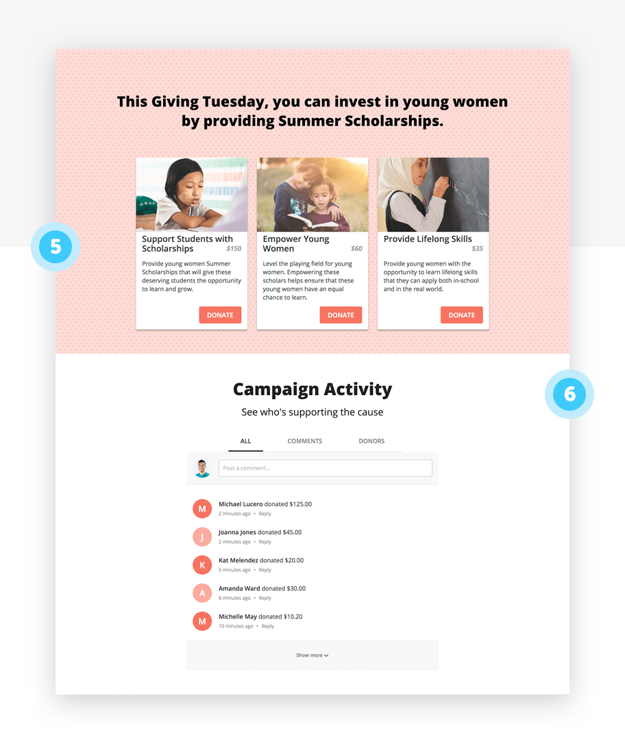
5. Impact
Be creative. Impact blocks don’t have to equate to physical impact (e.g. $100 = 100 meals) but should speak to your programs in a compelling way. The images and messaging should be consistent with the rest of the campaign.
Use the suggested donation amounts strategically. Identify your median gift size and use that as the lowest suggested amount. Order blocks from highest to lowest amount to encourage larger gifts. We recommend 3 to 4 impact blocks, but don’t be afraid to disable them entirely if you have other prominent donation calls to action on the page. You can also set background images; simple patterns or gradients create a cohesive aesthetic without being too busy.
Next: 7 Reasons to Leverage Classy’s Giving Tuesday Resource Center
6. Campaign Activity
Campaign Activity is a great way to show momentum and support from your audience. If you anticipate heavy donation activity or if your audience typically leaves encouraging comments, use this section to maximize energy and social proof on Giving Tuesday. Consider disabling this section if you anticipate lower volume, larger gifts, or if your supporters are sensitive to public recognition.
Pro Tip
Collecting a few donations from your audience and most dedicated supporters either earlier in the day on Giving Tuesday or earlier in the week will help create early momentum on the Campaign Activity feed.
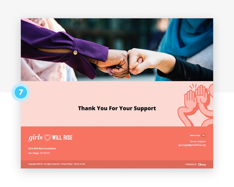
7. Footer
Check your footer to ensure it contains up-to-date contact information and matches the primary color of the rest of the campaign page.
Campaign Donation Page—Key Components Explained
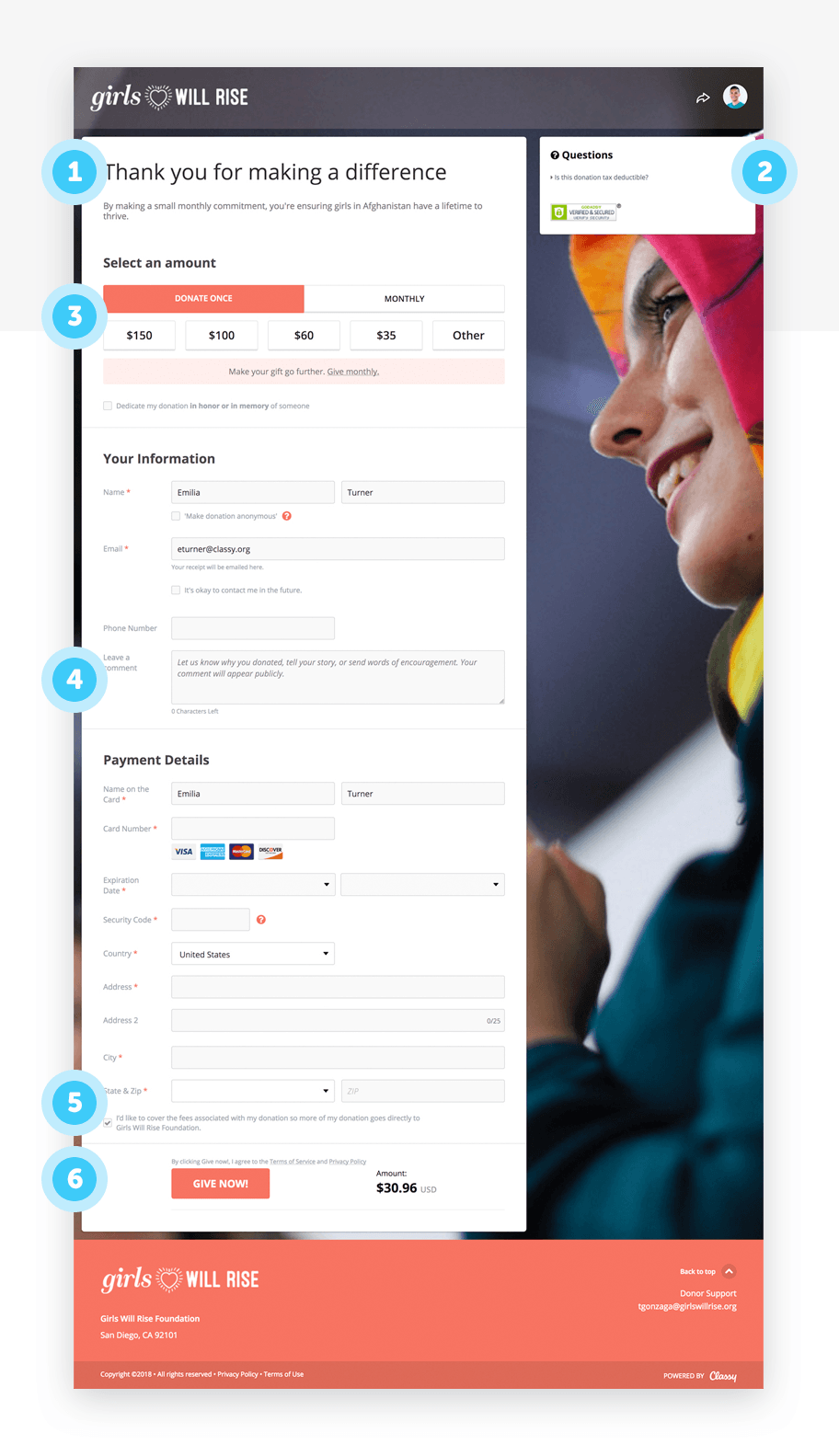
1. Appeal Section
To maximize conversions and keep your supporters interested, expand upon the appeal you included on your Campaign Landing page and be mindful not to reiterate the exact language you’ve used in previous campaign sections.
By keeping your appeal simple, you’ll avoid distracting your supporters and keep them moving down the donation page. We advise against using images or videos in your Donation Appeal for Giving Tuesday.
Never miss an opportunity to recruit new recurring donors. By turning on our Recurring Optimization Initiative when setting up your campaign, you can give your Giving Tuesday donors the opportunity to make their gift a monthly donation.
Donation pages have a different URL from your Campaign Landing page. If you have a group of supporters that you know are going to convert right away (e.g. board members, dedicated volunteers, staff) you can send them straight to the donation page to save these donors time and increase conversions.
2. Frequently Asked Questions (FAQs)
FAQs will only appear on desktop view. If you receive common questions throughout the day, consider adding FAQs to inform your donors about tax deductibility, how funds are utilized, and more.
3. Buttons
To ensure you’re not leaving any money on the table, the lowest suggested gift amount should reflect your typical average donation size (either for online giving holistically or from past Giving Tuesday campaigns).
4. Custom Questions
When adding custom questions, be mindful of whether the data collected from your supporters will make an impact on your fundraising efforts. To maximize conversation rates, consider removing unnecessary custom questions altogether or ensure the question is not required to make a donation.
5. Donor Covered Fees
Donor Covered Fees should always be turned on in the back-end of Classy. When it is, and checked by default, 80% to 85% of donors opt to cover the fees. On a day like Giving Tuesday, that can add up to real savings for your organization.
6. Donate Button
In your Advanced Designer, you can customize the text on your Donate button. If you choose to do so, keep it short, sweet, and action-oriented.
Donation Receipt Email—Key Components Explained
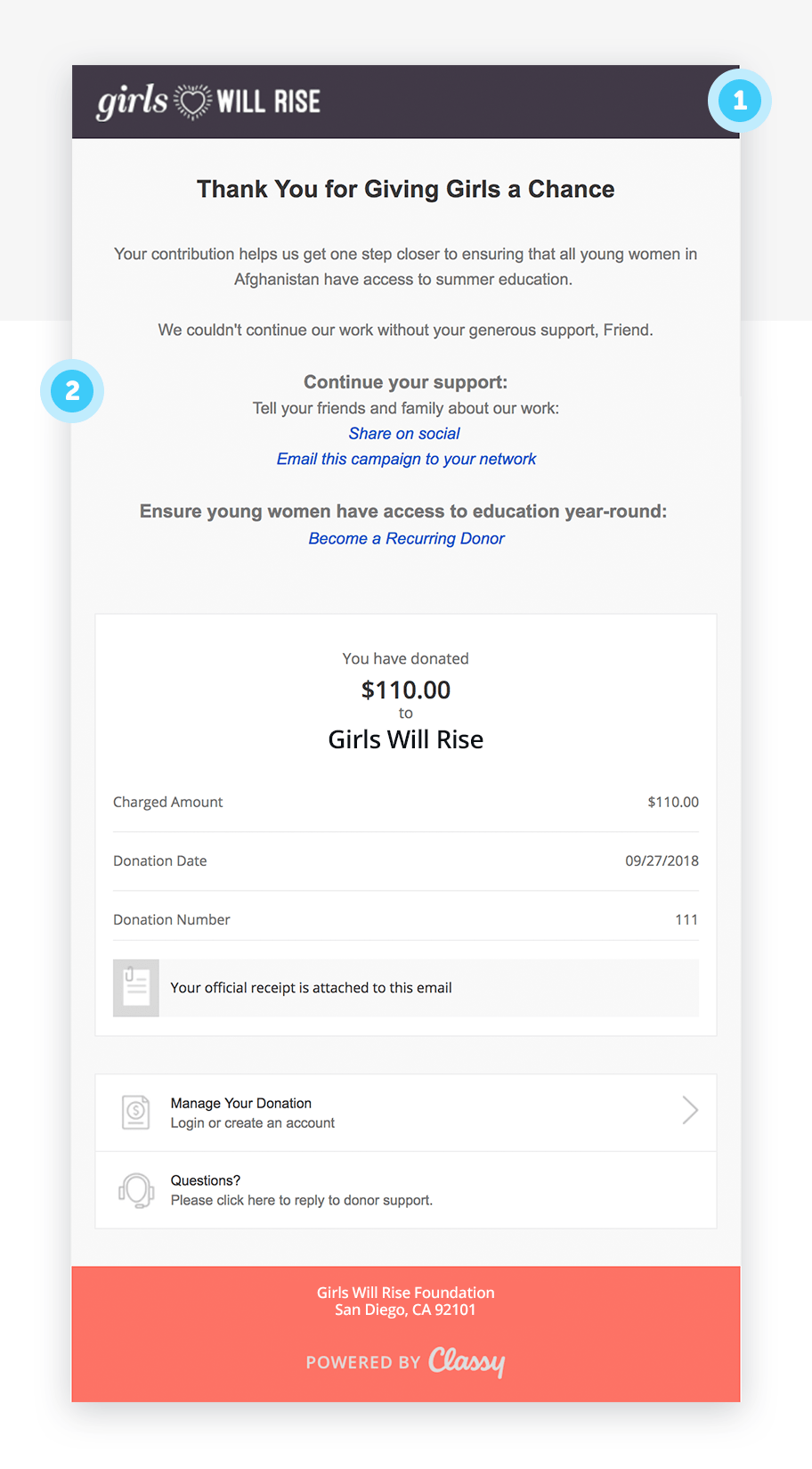
1. Campaign Logo
Customize your donation receipt email with your campaign logo and colors. Ensure your branding is consistent across all campaign elements.
2. Message Body
This email is the supporter’s last interaction and your first opportunity for donor stewardship. Convey the impact of their donation and empower them to share it with family and friends via email or social media.