Click here to read on Classy
by Justin Prugh
“How do I ensure the supporters who reach my donation page actually make a donation?”
As an account manager at Classy, I do a silent dance of joy at my desk when I receive this question. Why? Because it means I’m speaking with a client who wants to optimize one of the most important pages of their entire website.
Unless 100 percent of the people who come to your organization’s donation page actually make a donation, it means there’s room for improvement. And if your page does convert at 100 percent, I’d very much like to take you out for a cup of coffee, as you are an online fundraising Jedi, and I have much to learn from you.
In reality, when it comes to donation page conversions, supporters often don’t move forward with a donation for a myriad of reasons. Luckily, there are changes that nonprofits can make to their pages to convert their supporters into donors at a higher rate.
What would it mean to your organization financially if you improved your conversion rate by one percent? What about five? Heed the following tips and your organization will have the best chance at converting donors at a higher rate, and making more revenue for your cause. At the end of the post, be sure to get your free one-pager with donation page best practices.
1. Create Custom Donation Pages for Key Segments
We can’t say enough about email segmentation and its implications for more effectively engaging your supporters. However, email represents only one part of a supporter’s journey toward making a donation.
A common misstep some organizations make is to direct their very different segments to the same donation page, essentially treating it as a catch-all for every Tom, Dick, and Harry with a credit card. Unfortunately, the work they did to segment their communications is lost when potential donors land on this one-size-fits-all page, as what resonates with one segment on the donation page, may not engage another nearly as effectively.
When you create nuanced, unique donation pages for each of your key segments, you increase the potential that your message will strike a chord with your potential donors. Even minor adjustments to imagery and copy can create an uptick in conversions. Consider factors such as how familiar a given segment is with your organization, or whether they’ve donated before to determine what changes to make.
If your current donation page treats all supporters the same, try and direct the following key segments to a donation page of their own:
- First-time donors
- Recurring donors
- High-value donors
- Lapsed donors
- Former event attendees
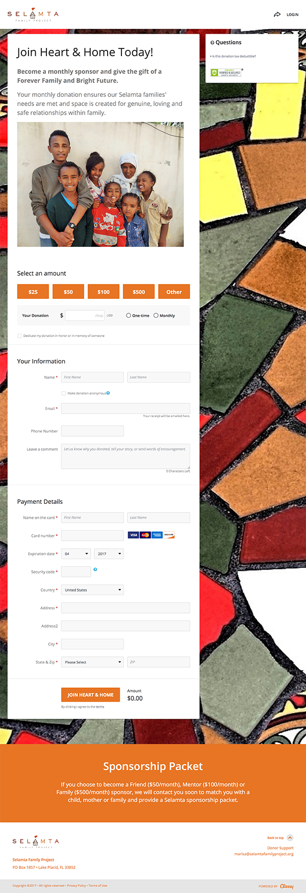
As you can see in this example from Selamta Project, their donation page plays a crucial role in a larger campaign geared towards converting recurring donors, it clearly speaks with that audience in mind.
2. Don’t Reiterate Your Appeal–Build Upon It
Another missed opportunity we see on donation pages is copy that merely re-articulates the message a supporter has just seen on a previous web page or in an email. Telling someone what they already know using different words generally isn’t as effective as presenting new, compelling information, which could nudge supporters further down the donor funnel–or better yet, entice them to increase their contribution amount.
To be clear, I’m not talking about adding a beefy, detailed paragraph. On the contrary, we recommend you keep the copy on your donation page succinct. However, in addition to a brief thank-you, having one or two lines of copy that shed even more light on your organization’s mission or the impact a donor can make continues to educate them and improves their overall experience.
To figure out what those cherry-on-top words may be for your organization, imagine it’s the eleventh hour and your supporter is going to base the next thing you tell them on whether or not they should donate to your cause. What is that extra context you can share that will expand what they already know and reinforce their decision to contribute?
Maybe it’s a statistic, quote, or an eyebrow-raising piece of insight. Maybe it’s not copy at all, but rather an emotional image.
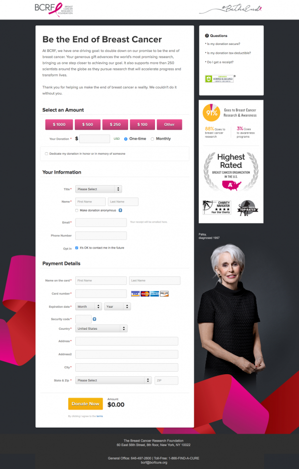
Check out this example from Breast Cancer Research Foundation, which aims to not only forge a connection between a donor and the meaningful work of 250 scientists, but also features the specific breakdown of how BCRF will spend the funds via an infographic on the right side of the page.
3. Streamline Your Donation Page for Ease of Use
When a supporter reaches your organization’s donation page, they’ve already come around to the idea of donating. As such, we don’t want to slow them down or deter them from accomplishing that task.
To that end, don’t overcomplicate your donation page. What seems like a valuable addition to you may feel like an annoying hurdle standing in the way of a completed task to your supporter. With each new piece of content you introduce, ask yourself, “Does this provide a smoother, better experience for my potential donors?”
To create a positive donation experience that advances your supporters towards the form:
- Keep your messaging short and sweet. Be thoughtful about every word.
- Format your copy so it’s easy to read. Break up a single, large block of text into smaller, shorter paragraphs to make the information feel less daunting. When appropriate, use bullets, bolding, and italics to guide a supporter’s eye to the most important information.
- If your page includes images, ensure they’re high-quality and relevant to the story you’re telling.
- Minimize potential distractions. Navigation options and hyperlinks to other webpages–even links to your own website–take your supporter away from moving forward with their transaction.
Don’t forget that the area “above the fold” (the portion of the page displayed before scrolling) is the most valuable real estate on a web page. If you have text below the fold (when viewing the donation page on a desktop), your copy is likely too long.
Here’s an example of a clean, well-formatted donation page from Coach Art. Notice how they’ve broken up the copy into three short paragraphs instead of lumping it all together, yet it’s still short enough to fit comfortably above the fold.

4. Gather Purposeful Information
In the same way you want to remove obstacles above the fold on your donation page, they should also be absent below. With that in mind, when it comes to the form portion of your donation page, collect only need-to-know (vs. nice-to-know) information–and when in doubt, leave the question out.
If you do choose to include additional required questions, make the question actionable and do something meaningful with the data you gather. For example, if you plan to run a birthday campaign, or if it’s important to segment your audience by age in order to communicate with them more effectively, then asking for a donor’s birth date makes perfect sense. Otherwise, don’t bother.
In the case of optional questions, there are a small number of cases where they tend to come in handy, but in my experience, those instances are few and far between.
When supporters arrive at your form, many make a snap judgement about how much time and effort it’s going to take to complete. The longer your form is, the more daunting the burden of filling it out appears. As such, if you can live without the information, then why risk turning a supporter away? Omitting optional questions keeps forms neat and tidy.
5. FAQs Should Actually Be FAQs
Frequently Asked Questions (FAQs) are extremely valuable for giving hesitant supporters the extra information they may need to feel confident about making a donation. They can also make your life easier by proactively addressing questions that surface related to the donation process, thereby lightening your team’s workload.
The trap some organizations fall into is including questions in their FAQ section which aren’t asked that frequently at all, or worse yet, do not pertain to the donation process at all. In this instance, those additional questions slow your donors down and potentially even inadvertently raise doubts that weren’t there in the first place.
Like the copy on the rest of your page, when it comes to FAQs, fewer is generally better.
6. Take a Walk in Your Visitor’s Shoes
Sometimes, as the creator of donation pages, you’re so deep in the weeds that you lose sight of what it’s really like to come to a donation page as a newcomer. Once you’ve created your donation page, look at it with a fresh set of eyes to see what the experience is really like.
Read every word and fill in each field with real information to see how long it actually takes to make a donation. Share it with your colleagues and gather their feedback. If you have a trusted supporter you’d feel comfortable reaching out to for their input as well, even better. Ask them:
- Would they fill it out?
- What content is unnecessarily slowing them down?
- What’s missing that may be raising doubts or confusion?
- What’s included that can be tightened up or removed entirely for a more efficient experience?
Contemplate these questions and revise your donation pages based on the input you receive. This will allow you to arrive at a version that’s more likely to get potential donors to convert.
For nonprofits, the challenge of more effectively converting supporters into donors is one worth taking on. If you continuously experiment to discover what works, what doesn’t, and why, you’ll provide a better experience for your donors and receive more money to support the work of your organization.
Do you have further suggestions for increasing donation page conversion rates? We’d love to hear about them in the comments below!
Download Your Free Donation Page Best Practices Tip Sheet
Justin Prugh is an account manager at Classy who prides himself on helping his clients achieve solid results with their online fundraising campaigns. Outside the office, he can be found riding his bicycle along the coast or fine-tuning his backhand on the tennis court.
Return to Insights & Events