Click here to read on The Bridgespan Group.
By: Libbie Landles-Cobb, Mariah Collins, Bob Searle
Nonprofits that learn and improve over time have consistent approaches to measurement. It’s how they know they are making a difference, driving toward operational goals, and creating inclusive and equity-focused programs and internal cultures. They may also be asked for data by others—their boards, funders, or constituents—but measurement is first and foremost to inform their own learning.
Priorities and Metrics Examples
Need some help getting started on the right information to track? This resource provides examples of priorities and metrics for your leadership team across common organizational categories.
Yet, in our work, nonprofit leaders often tell us that they don’t have the data they need or aren’t sure how to use data to learn and ultimately make decisions that lead to continuous improvement. Good data can lead to good decisions, but nonprofit leaders sometimes fall short for a few reasons:
- Overwhelmed by the task. Let’s face it: collecting data, particularly impact data, is hard. Some teams don’t know where to start, so they don’t measure much at all.
- Too much data. We’ve seen many organizations collect too much data, which leads to confusion about what actually matters.
- The wrong data. The data others want to see isn’t always the data needed to make decisions—so leaders spend time and energy measuring unhelpful things.
- Lack of a “data culture.” Using data to make decisions requires building organizational muscle. An organization must consistently track and review data about its most important work and make decisions based on that data.
A nonprofit dashboard can help any leadership team. It tracks the vital few metrics an organization needs to measure and monitor. Which metrics should be included in a nonprofit dashboard? A car’s dashboard doesn’t display every piece of information about the car—just the few things that are most important to keep an eye on. Likewise, an effective nonprofit dashboard helps leaders focus on what matters most, assess progress in a timely way, and act and follow up. This article looks at each of these elements.
Get aligned on organizational priorities (not necessarily metrics)
There are lot of things nonprofits can track, and many of them feel important. But when it comes to a leadership team’s limited time and resources, it’s critical to be clear about what matters most.
Effective nonprofit dashboards are anchored in priorities. This helps leaders see if they are making progress toward their goals. Other data may be tracked elsewhere, such as by departments. But leadership teams should stay focused on the most important drivers of impact and performance.
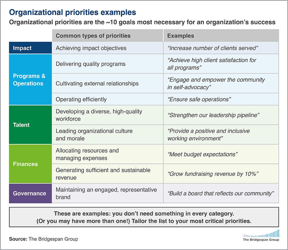
Organizational priorities are the short list (rarely more than 10) of the most critical activities needed to ensure success and maximize impact. These priorities may come from a strategic plan or from other planning efforts. What gets tracked is what stays front and center. So if an organization cares about developing a diverse, high-performing program team, it should include the goal in the dashboard.
In our experience, nonprofit and NGO priorities tend to fall into five categories, and within those categories a few types of priorities are common. The figure below includes some examples.

The important thing is to be very specific about what matters for the organization. A dashboard should be the answer to the question—what are the things we need to pay attention to as a leadership team to ensure we are making progress toward our goals? Answering this question helps re-orient your dashboard from what you are measuring to why you need to measure it.
Assess progress: Focus on “check-engine-light” metrics
A dashboard should point leaders to the right information at the right time. Just like in a car, if the “check-engine light” comes on, leaders know they need to start addressing a problem. A nonprofit dashboard should include metrics—one or two per priority—that provide just enough data to know how things are going. If something signals red, it’s time for a deeper look.
This data can include qualitative as well as quantitative data. For example, an organization may have a priority around “ensuring constituent feedback is regularly incorporated into their programs.” The indicators could be based on the amount and quality of feedback from program staff and participants. It could be tracked with an indicator based on “progress toward constituent feedback goals” that shows up as on track, delayed, or behind, as a summary of a more detailed assessment of how the organization is tracking its progress over time.
The key is defining metrics that are easily tracked at regular intervals, even if that data isn’t perfect. Consider an organization with a priority to increase the general public’s knowledge and awareness around a particular issue. Measuring public opinion can be time-consuming and expensive. The organization may only have the resources to do this occasionally (if they’re lucky)—so it won’t be effective as a dashboard metric. For its performance dashboard, it might choose interim measures or progress indicators, such as how many participants attend events, or a data point that reflects partnership activities with key organizations.
With metrics identified, leaders need to define what the data means. The best dashboards use targets to signal whether they’re on track (green), veering off track (yellow), or significantly off track (red). Targets should be set for a timeframe that is meaningful, which is usually three, six, or 12 months. Alongside the targets are the actual data points, often with colors that signal whether the indicator is on track, delayed, or behind.
Some longer-term targets may need to be broken down into nearer-term goals. For instance, an organization may have a long-term goal to have staff demographics reflect the population it serves, with a five-year goal of having 60 percent of its staff be people of color. If its staff is only currently 30 percent people of color, it is likely unrealistic that it could reach the goal in one year. But the organization can hold itself accountable for meaningful improvement as staff turns over or headcount grows. It can define that meaningful improvement clearly by setting near-term targets for its dashboard that its leaders believe they can make with new investments and processes. Thus, they may set a one-year target of, say, 35 percent. If they miss that, they can look deeper to understand what is happening and correct course as needed.
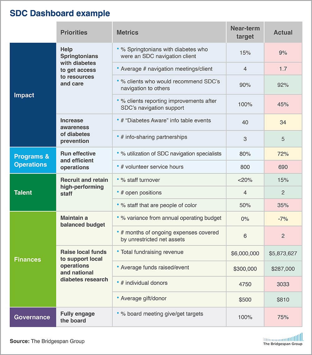
Here’s a sample nonprofit dashboard from a hypothetical organization, Springtown Diabetes Care, whose mission is to improve the quality of life of people in Springtown living with diabetes and to reduce the number of community members who get the disease. This dashboard:
- Orients around its critical organizational priorities.
- Contains only the vital few metrics in each category that the leadership team needs to pay attention to right now.
- Sets clear goals and uses green, yellow, and red to show progress toward each goal.
Shows both red and yellow, reflecting actual performance. If a dashboard has green for every metric all the time, it probably isn’t ambitious enough; don’t be afraid of some red, which signals that there is room to improve.

Act and follow up: Establish processes to ensure the dashboard supports decision making
Gathering data is only worth it if you use it. To use a nonprofit dashboard effectively, leadership teams adopt a few simple but powerful habits to understand the data, take action, and follow up.
When a metric signals red, it’s time to dig deeper. Why are we off track? It’ll be important to talk with those most involved with the area—including constituents and communities—to better understand the problem and what the causes and solutions might be.
Once leaders identify what needs to happen, they are specific about who is responsible for leading, when it will happen, and how progress will be tracked. If a metric goes the other direction—from red to green—it may be useful to understand why things are going better and to gather insights that can support further improvement.
One of the greatest benefits of using a nonprofit dashboard with a leadership team is the opportunity to develop a culture of continuous improvement. This requires a serious and intentional effort—which can pay off over time.
Here are some basic practices in using a performance dashboard for continuous improvement:
- Determine how frequently you will review the dashboard. Many teams find quarterly reviews are frequent enough to take action when data signals concern, but not so frequent that data collection is an undue burden. Schedule review sessions well in advance and ask your teams to prioritize them.
- Assign a “dashboard lead.” This person is on point for updating the dashboard. If you have a data person, great! If not, ensure the dashboard lead has enough capacity and accountability to coordinate with others to gather the necessary data.
- Assign “metric stewards.” For each metric on the dashboard, be clear who is accountable for gathering the data and getting it to the dashboard lead.
- Plan the review session agenda. Don’t just go metric by metric through the dashboard. Prioritize areas (usually reds and yellows) where the team needs to engage to align on steps to address. Be sure to celebrate successes as well, but don’t spend the bulk of your time there.
- Assign pre-work. Send out dashboard materials in advance and ask the team to review them. For the most significant reds and yellows, it might be helpful to include more information about why the data is not on track so the focus of the team meeting can be on solutions.
- Build shared ownership. Hold the entire executive team accountable for understanding and participating in discussions about the status of the dashboard. The role of the executive team is to have shared ownership and accountability over the progress of the major initiatives of the organization, not just to “stay in their lane” and only participate when their division is involved.
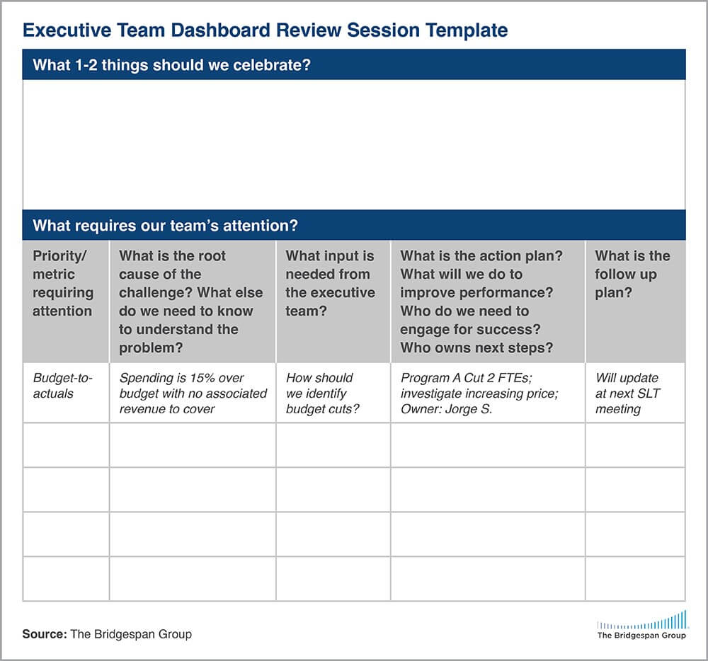
- Drive to action and capture next steps. In the review meeting, orient around what steps need to be taken to address reds and yellows. Write down next steps, who is accountable, and by when. Consider a dashboard action template, like the one on the following page, for planning your agenda and capturing next steps.
- Follow through. Set deadlines and then check back. You might use time in your regular leadership team meetings to check on progress and hold point people accountable.
- Close the loop. Share data and information back with the constituents and communities that are taking the time to provide input and data. It’s an important step in every organization’s approach to measurement, learning, and evaluation.
For nonprofit and NGO leadership teams, a nonprofit dashboard can be one of the most important ways to exercise leadership—aligning on what matters most, assessing progress regularly, and continuing to improve the organization’s operations and impact.
Return to Insights & Events


